
Nombre de resultats 1
per a Visualization
18/08/2011 - Using Gephi to visualize keywords and landing pages from Google Analytics
As of late, I've been playing a lot with data analysis and visualization tools. Recently I've read two interesting books (Statistical Analysis with R and Visualize This: The FlowingData Guide to Design, Visualization, and Statistics
 ) and I'm on my way to another two to refresh my statistics knowledge.
But this post is only mildly related to these books, since it started way before: the day I read about Gephi. Gephi is an open source graph visualization tool, to work with huge (or at least very big) datasets and graphs. I've seen it used to graph the friendship network from Facebook, or to graph tweet-retweets from Twitter (these two can be found in the Learn section from the Gephi website). In this post I'll guide you step by step to do a keyword-landing page directed graph, using data from your Google Analytics account.
A directed graph is a graph with arrows. You have a set of sources (in this case keywords) and targets (in this case landing pages), and aggregate sources by name. Plot this, and you have a keyword-landing page graph like this one (data for the last month in mostlymaths.net restricted to the first 500 keywords).

What interesting things you can read from such a graph
- Clustering: In this particular instance, I can find the "clusters" of my blog. You can see 3 big aggregations of keywords and landing pages (left-middle,up-center and right-middle). Each one of these marks pages and groups of pages with several landing keywords. The groupings mark like the "big themes" in my blog, at least from search engine traffic (these are memory techniques, 9 best programming books I've read and seed germination respectively). Oddly enough, I've had one visit landing in seed germination from the keyword "gnus mail", thus the big seed germination cluster includes emacs.
- Big keywords: In gephi you can scale nodes depending on other table variables. For example, I can scale the landing page dots depending on the number of keywords, or the number of visits. In particular, I can show which keywords lead to more of my pages, by using the outDegree (number of arrows escaping) of a node.
- Big pages: Alternatively, I can scale nodes with the inDegree (number of arrows entering) to learn which pages have the most different keywords. I can also label the arrows with the number of visits (and scale them with this metric).
- Huge pages: with a little more work, I could scale with total visits to see which are my biggest pages together with the landing keywords.
Step by step guide
I'll assume that you can manage to download and install gephi on your own, and have some knowledge of Google Analytics. Of course, the first you need is to select the keyword and landing page fields in your Google Analytics page:

Then select Show Rows and select 500:


And get a nice CSV file with the export tab on top:

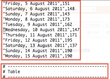
Remove all this, below Table you should have the useful data,


Now I don't know if this is because I select CSV and not CSV for Excel, but you have to clean the file: there are a lot of table identifiers to remove before the real data table. You also need to remove a line at the end of the file. You can do all this editing with any plain text editor. I used emacs.


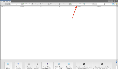
Remove the last line with dashes. Now the file is almost ready to be imported... You need to rename the Visits column to something else, for some odd reason Google Analytics copies the same column twice and Gephi needs unique column names. Ready to import! In Gephi, go to the Data Table window from the Window menu, and click Import Spreadsheet:

And now you should select edges table and comma-separated:

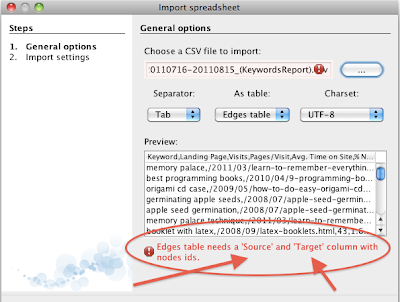


Oops! More tweaking of the CSV file is needed: Change the first two columns to Source and Target (and don't forget to mark comma as I did, too) and re-import the file:

After clicking next, Gephi will ask you for the types of the columns. Since I'm only interested in visits, pages/visit and average time on site, these are the only columns I want to be floats. You need them to be float to scale the nodes according to these parameters:

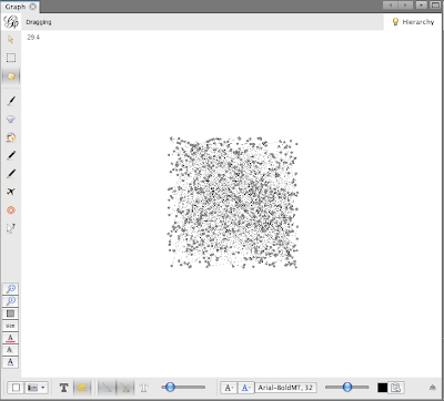
Next, we'll see a blob of points with no labels. Choose the Force Atlas algorithm in the Layout window, run for a while and then click stop:


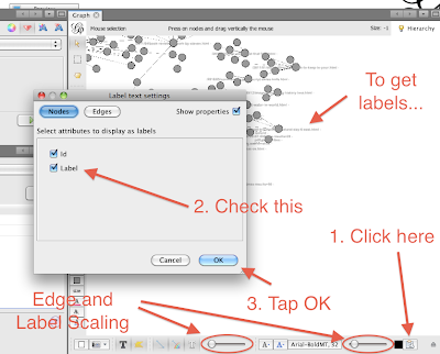
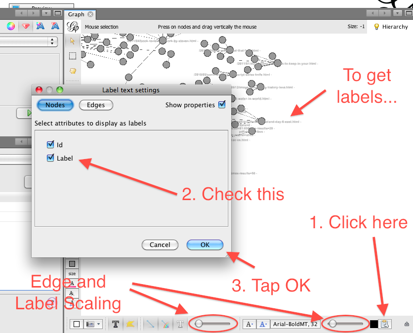
The result from the Force Atlas algorithm to distribute points will look nicer, spreading aggregates of arrows all over the place. Now we need to get the labels. To do so, you have to click on a somewhat hidden button in the bottom-right part of the Graph window, and select the correct names for the tags. In this picture I've also marked the label and edge scaling according to parameters:
Once you have labels, you need to play with the layout to make them more visible. Run the algorithm Adjust Labels for a while, then Force Atlas and repeat until you are happy with the results:

You can also set labels for the edges, if you are interested in seeing visits, for example. But I found it messy and unchecked the option. Finally, to scale the nodes, use the Ranking window:

The arrows mark the different ways to adjust: you can change colour, size, text size or text colour. Feel free to play with all these settings!
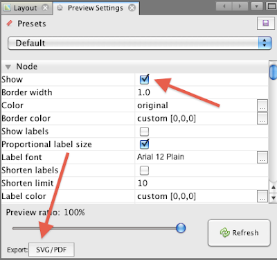
You can get a nice PNG file of you graph by pressing the camera-like icon in the Graph window (clicking the down-arrow will list the properties), or you can export a PDF or SVG with some more work from the Preview window. Both result in very nice images, but a SVG or PDF can be tweaked extensively using Illustrator or Inkscape. But it also needs more work from the Gephi side, so I won't enter into the details in this tutorial. Well, just a little! Be sure to check "show" before exporting, or you'll see a blank page:
You can get a nice PNG file of you graph by pressing the camera-like icon in the Graph window (clicking the down-arrow will list the properties), or you can export a PDF or SVG with some more work from the Preview window. Both result in very nice images, but a SVG or PDF can be tweaked extensively using Illustrator or Inkscape. But it also needs more work from the Gephi side, so I won't enter into the details in this tutorial. Well, just a little! Be sure to check "show" before exporting, or you'll see a blank page:

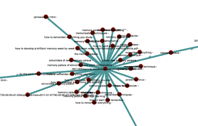
And with just these steps you can create quite nice (and useful) graphs like this one:


And here you can find a closer zoom:

I hope you enjoyed this tutorial, if you did it would be awesome if you share it. I'll try to do a few more Gephi tutorials as I find more interesting (for me) uses of Gephi. I have also a few post /tutorial ideas about visualizing Facebook Insights data for pages and using Google Fusion Tables. Stay tuned!


